Daniel Quay
Work: Case Studies Identities Type Marks
Stapleton Dental
THE ASSIGNMENT
An approachable, playful brand chock full of nostalgia.
STUDIO
Consume & Create
Identity Design for a dental office invested in good smiles and good feelings.
An approachable, playful brand chock full of nostalgia.
STUDIO
Consume & Create
ROLE
Lead Designer.
My largest contributions were designing the wordmark & supporting design language, establishing messaging & tone.
CREATIVE DIRECTION
Josh Wills & Steve Hurd
DESIGN SUPPORT
William Johnston
CONTRIBUTING DESIGNERS CITED ON RELEVANT IMAGERY.
Lead Designer.
My largest contributions were designing the wordmark & supporting design language, establishing messaging & tone.
CREATIVE DIRECTION
Josh Wills & Steve Hurd
DESIGN SUPPORT
William Johnston
CONTRIBUTING DESIGNERS CITED ON RELEVANT IMAGERY.

MUSE
Ironically inspired by the wonder of early ice cream shops,
Stapleton Dental is warm from nostalgia, with the trust of hospitality. Smile!
Ironically inspired by the wonder of early ice cream shops,
Stapleton Dental is warm from nostalgia, with the trust of hospitality. Smile!


ICONOGRAPHY
The iconset was inspired by the golden age of neon and in-era drive-ins, to keep the system feeling approachable and cheeky. No pun intended.
The iconset was inspired by the golden age of neon and in-era drive-ins, to keep the system feeling approachable and cheeky. No pun intended.
THE SECONDARY SYSTEM
Using bright colors and friendly but direct messaging, the secondary system aims to make dental visits engaging in the good way.
Using bright colors and friendly but direct messaging, the secondary system aims to make dental visits engaging in the good way.
INSTALLATION
Illustrating ‘friendly dental tools’ was a memorable challenge: about as challenging as installing vinyl of the icons on the office ceiling.
Illustrating ‘friendly dental tools’ was a memorable challenge: about as challenging as installing vinyl of the icons on the office ceiling.

WAYFINDING
For wayfinding, a punny set of color-coded posters to infuse some squeaky-clean humour to the office. These puns are intended.
For wayfinding, a punny set of color-coded posters to infuse some squeaky-clean humour to the office. These puns are intended.
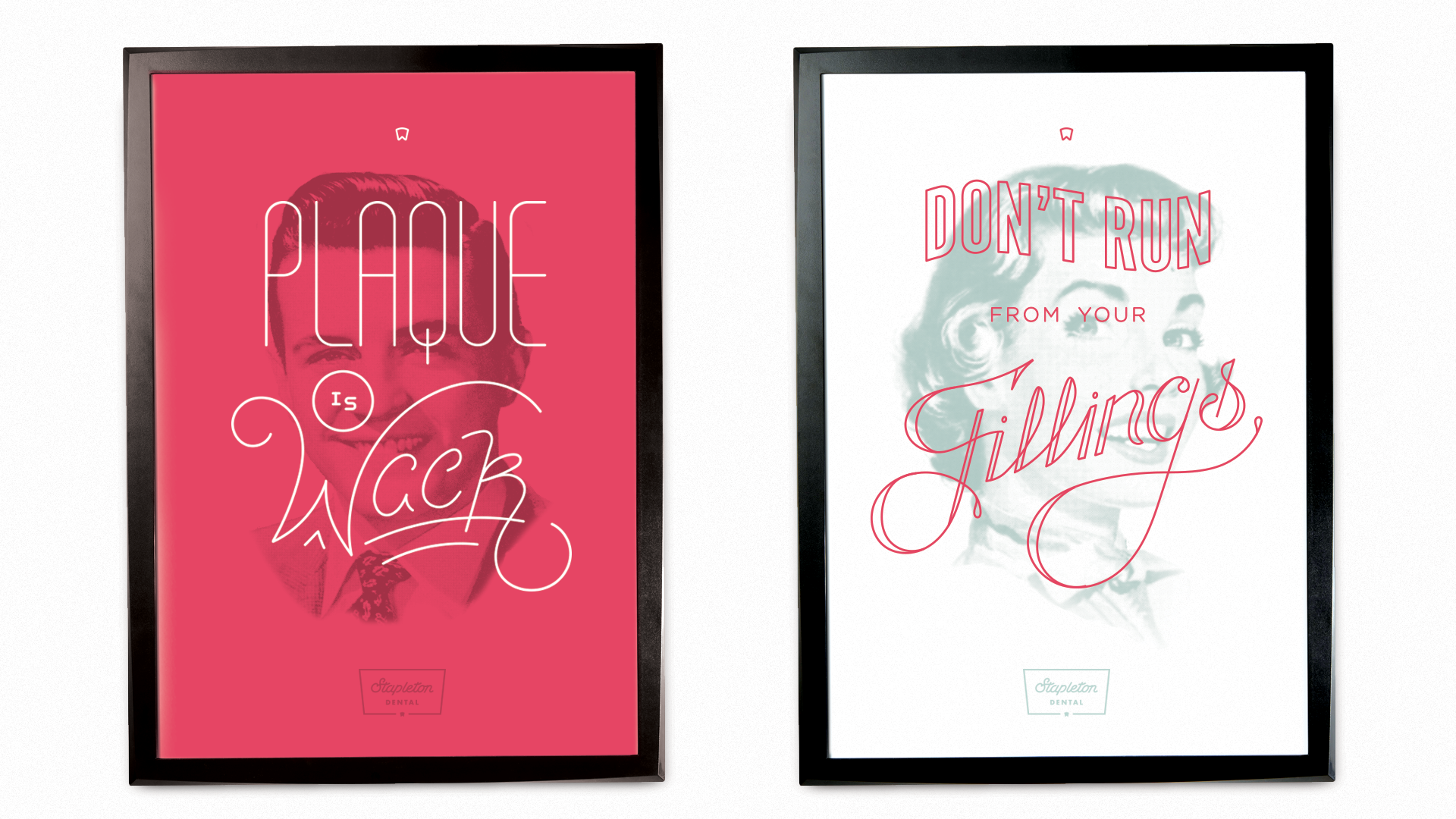

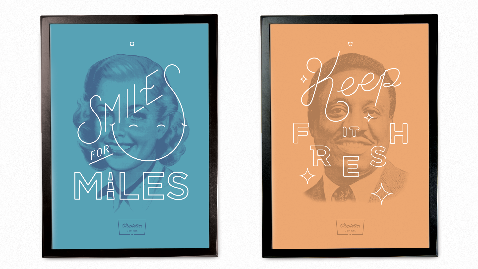
^ WILLIAM JOHNSTON CONTRIBUTED TO THE TYPE OF A FEW OF THESE
AS AN ASIDE, This project encouraged me to go to the dentist after waiting about thirteen years. I needed seven fillings. The dentist told me that if i had waited any longer i could have had to undergo surgery.
I guess i’m saying this to encourage you to go to the dentist if you have been putting it off.
OK, I’LL HOP OFF MY SOAPBOX.
I guess i’m saying this to encourage you to go to the dentist if you have been putting it off.
OK, I’LL HOP OFF MY SOAPBOX.

Stapleton Dental.
Don’t run from your fillings.
FIN