Daniel Quay
Work: Case Studies Identities Archive
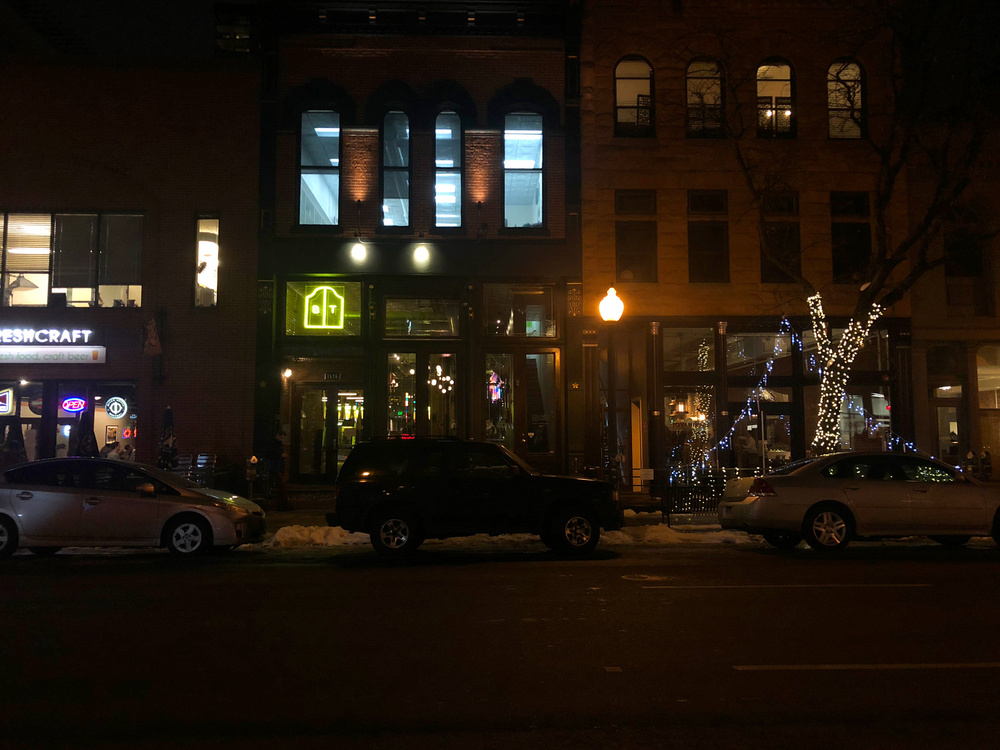
Brass Tacks
THE ASSIGNMENT
A welcoming and approachable place steeped in familarity and surprise.
STUDIO
Consume & Create
Identity Design for a new bar in the “neighborhood of downtown Denver.”
A welcoming and approachable place steeped in familarity and surprise.
STUDIO
Consume & Create
ROLE
Art Director and Lead Designer.
My largest contributions were designing the wordmark, logo, supporting design and type systems, design & production of the menu system, exterior signage, interior design and lead messaging.
CREATIVE DIRECTION
Josh Wills & Steve Hurd
DESIGN SUPPORT
William Johnston
CONTRIBUTING DESIGNERS CITED ON RELEVANT IMAGERY.
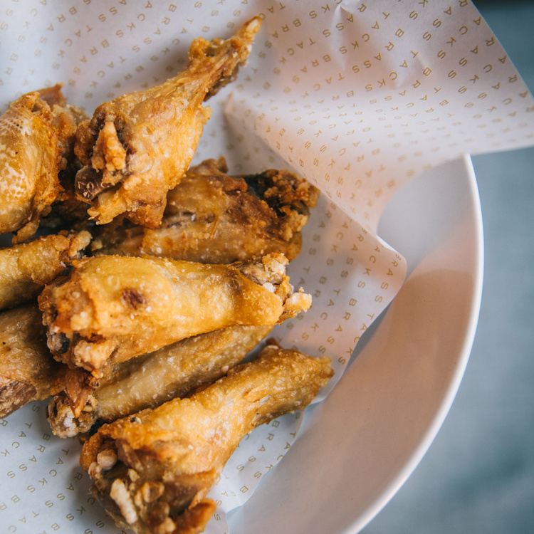
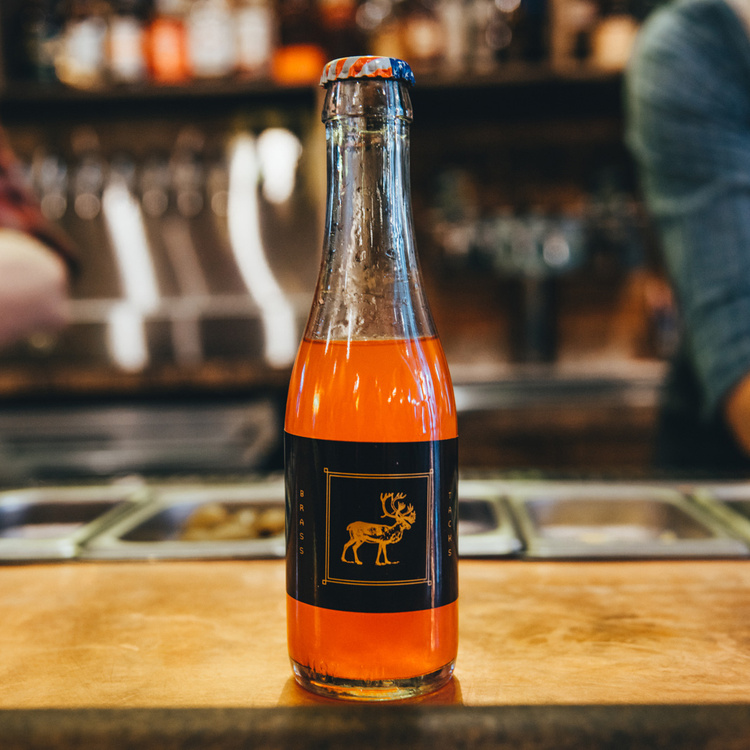
PHOTOGRAPHY BY LUCY BEAUGARD, ORIGINALLY FOR DENVER EATER.
Art Director and Lead Designer.
My largest contributions were designing the wordmark, logo, supporting design and type systems, design & production of the menu system, exterior signage, interior design and lead messaging.
CREATIVE DIRECTION
Josh Wills & Steve Hurd
DESIGN SUPPORT
William Johnston
CONTRIBUTING DESIGNERS CITED ON RELEVANT IMAGERY.
PHOTOGRAPHY BY LUCY BEAUGARD, ORIGINALLY FOR DENVER EATER.
MUSE
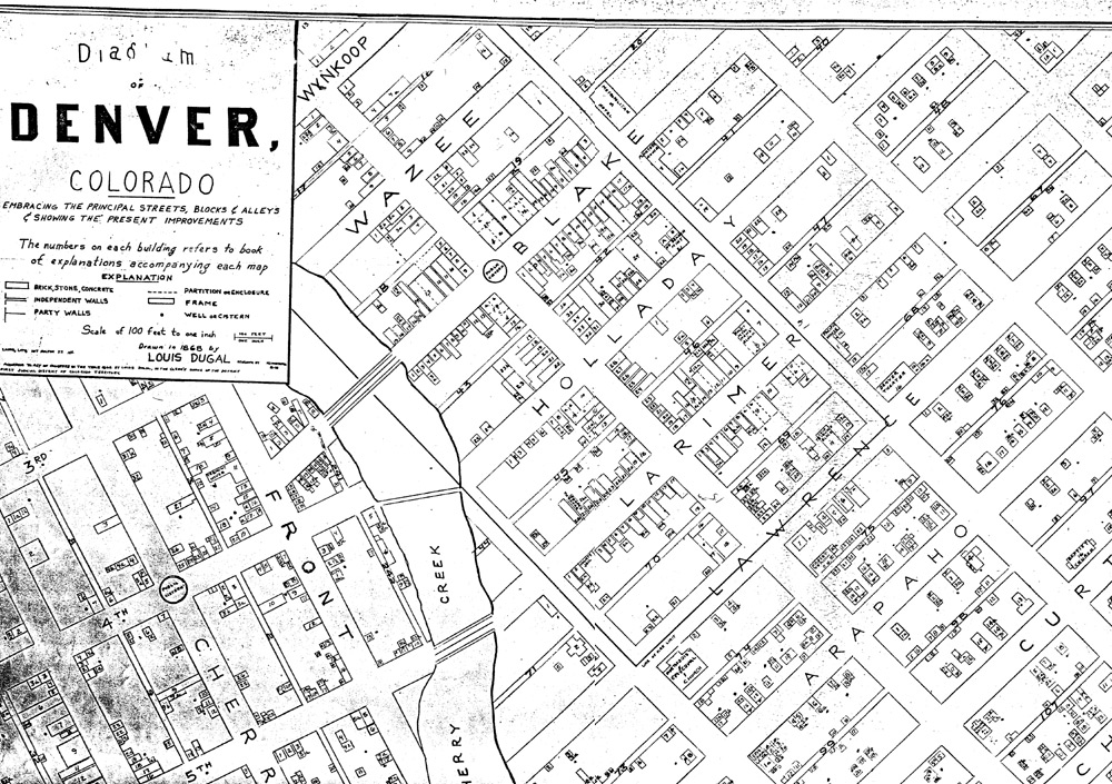
The “Blake Street Vault” is one of Denver’s oldest buildings. In the early 1860's the building served as a saloon and boarding house in the center of the first business district of Denver. Historic Denver photos from as early as 1866 depict the Charles Eyser Saloon with covered wagons tied up in front.
Inspired by the building’s many lives, the design language speaks to the history of each tenant of 1526 Blake Street, and how Brass Tacks, too, is leaving a mark on history.
THE LOGOTYPE
The bespoke logotype was crafted with curves inspired by ox yokes, early load-bearing pillars, rail cart tracks, and covered wagons: all hearkening to past eras the building has stood through.
* Fun fact, below the ENTIRE 15th street block is a rail system,
built to allow quick and...discreet transportATION between buildings.
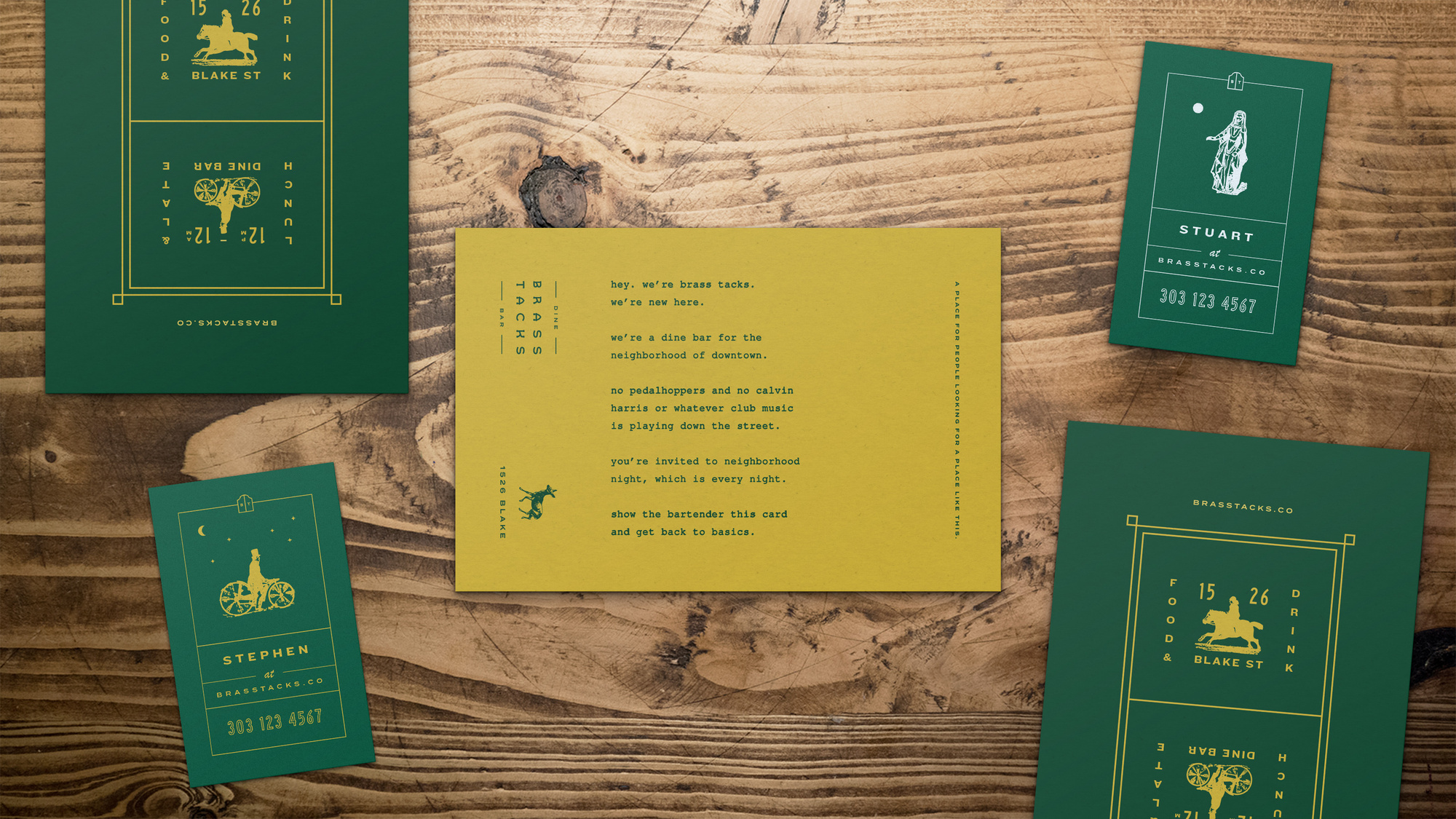
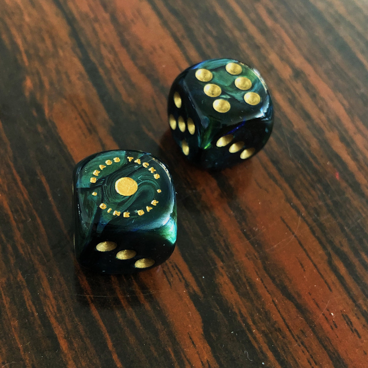
THE BYLINE
The byline “Dine Bar” was brilliantly coined by my studiomate William Johnston, winking to the clash of “dive bar” and “diner” aesthetic within the space, delivering something altogether new.
The byline “Dine Bar” was brilliantly coined by my studiomate William Johnston, winking to the clash of “dive bar” and “diner” aesthetic within the space, delivering something altogether new.
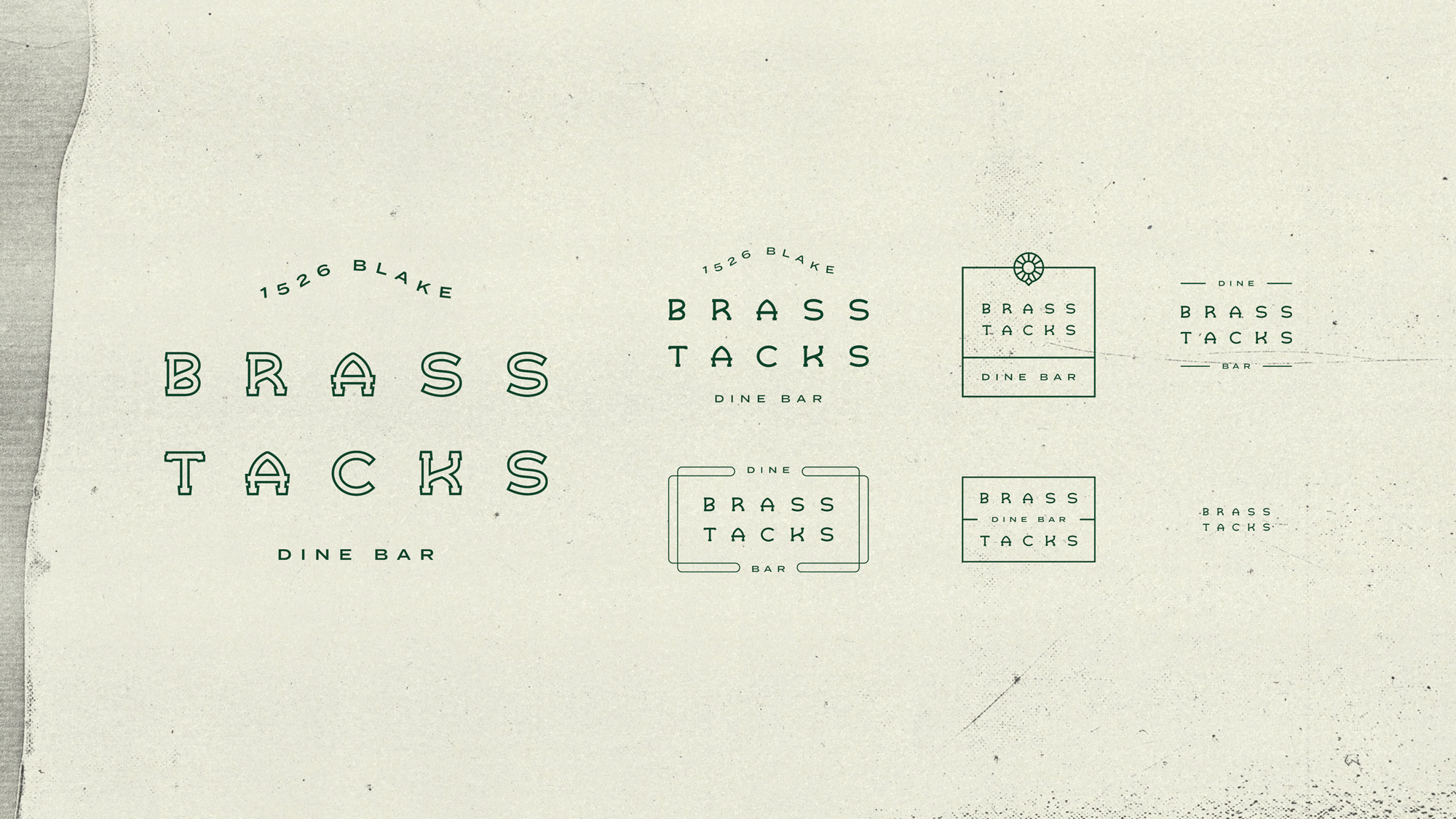
^ SOME OF THESE FUN ELEMENTS WERE CRAFTED BY WILLIAM JOHNSTON
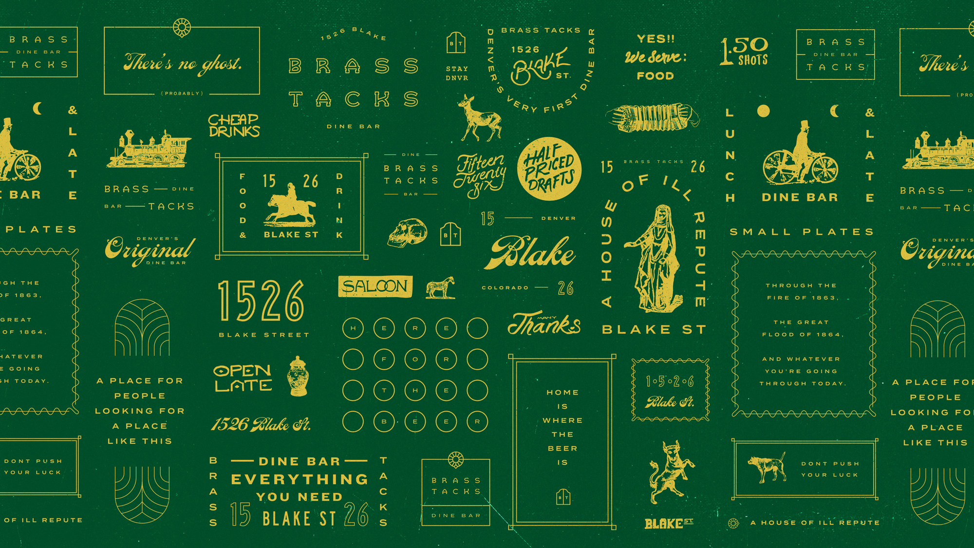
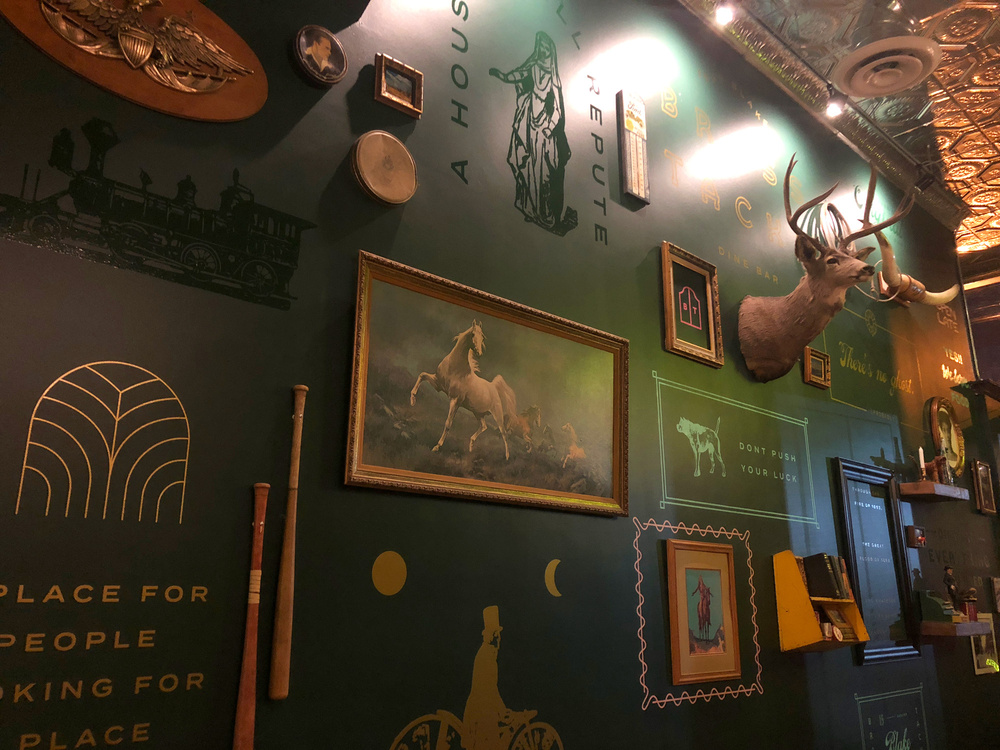
THE SECONDARY SYSTEM
The secondary design system was inspired by “found objects” throughout the eras.
Sign painter inspired type, long lost etchings, and art deco frames all come together to make a system that feels like a collection of well-loved artifacts from decades past.
To temper this eclectic design system several border styles were introduced, each informed by natural framing throughout the history of the building; cornicing, curtain rods, and the very same border on the hundred-year-old vault in the basement.
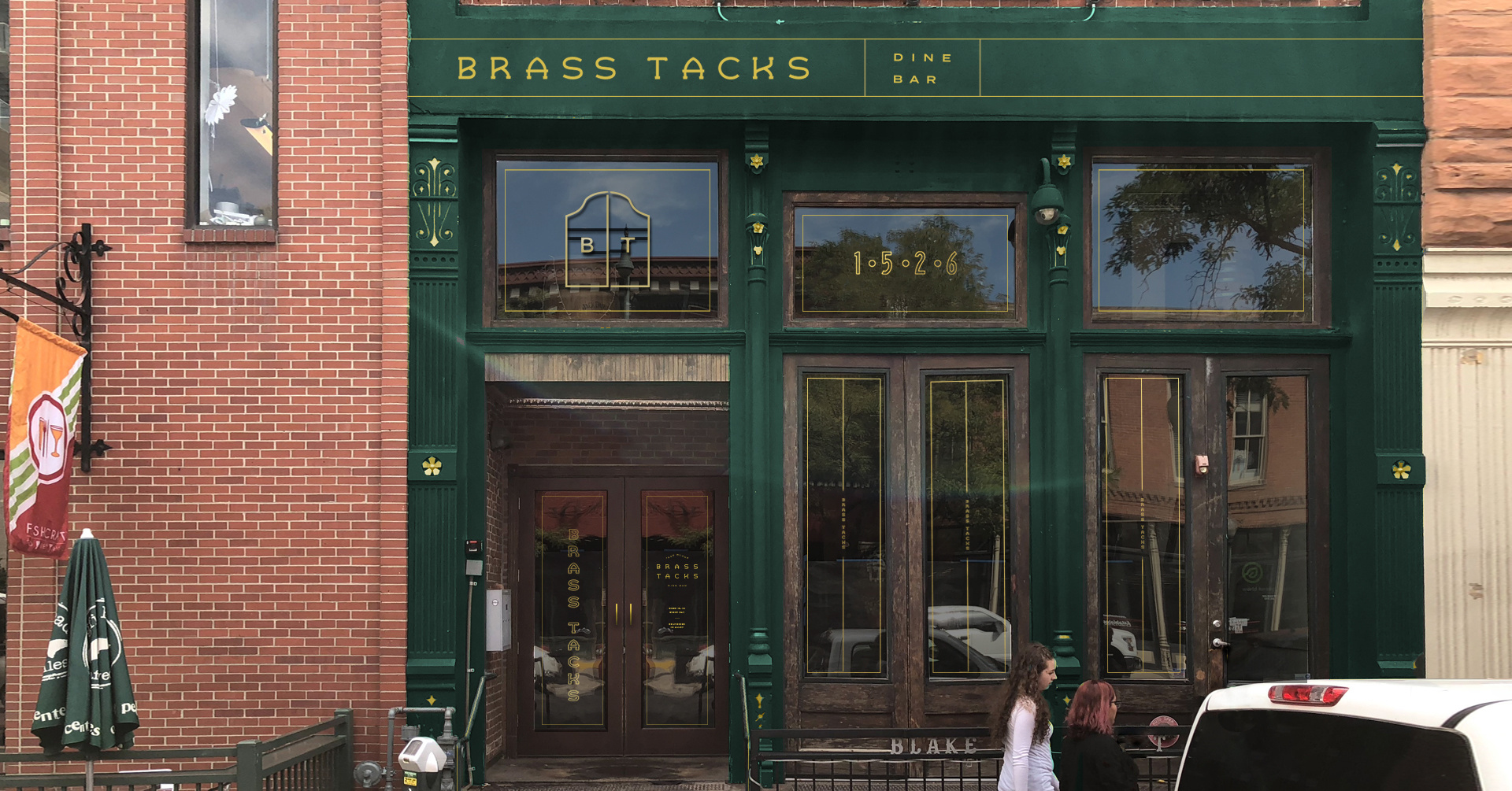
TYPE
The type system finds its roots in print production methods throughout history: sign painting, wood block and letterpress, diner neon and typewriter styles.
Each expression has one foot in the sophistication of the Kentucky Derby and the approachability of a neighborhood bowling alley.
The type system finds its roots in print production methods throughout history: sign painting, wood block and letterpress, diner neon and typewriter styles.
Each expression has one foot in the sophistication of the Kentucky Derby and the approachability of a neighborhood bowling alley.
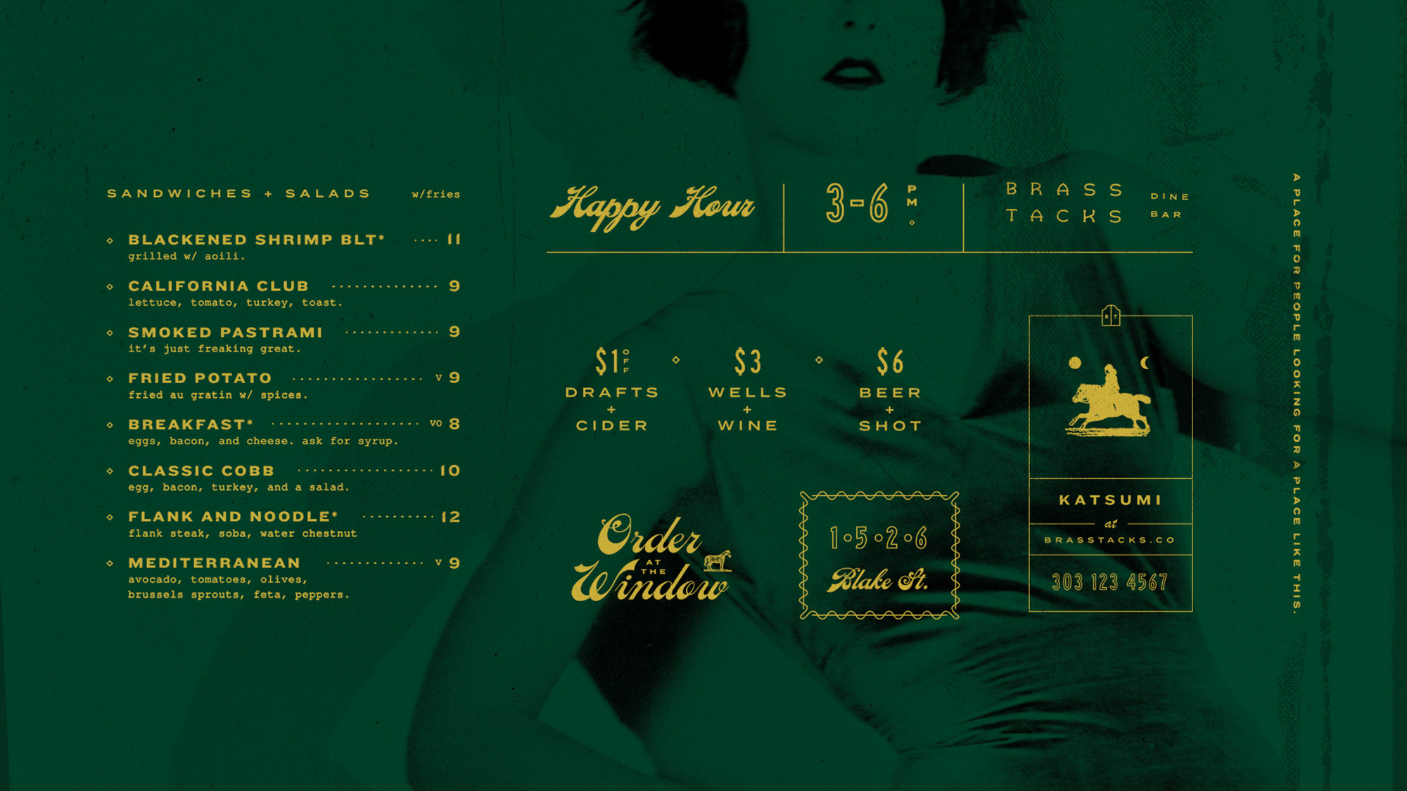
^ WILL JOHNSTON DESIGNED THOSE POCKET COCKTAILS
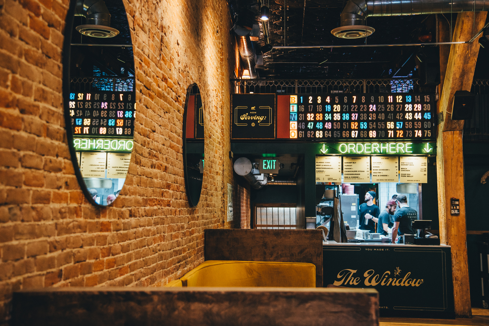
^ WE WORKED WITH SCOUT INTERIORS TO MAKE “THE WINDOW” A REALITY.
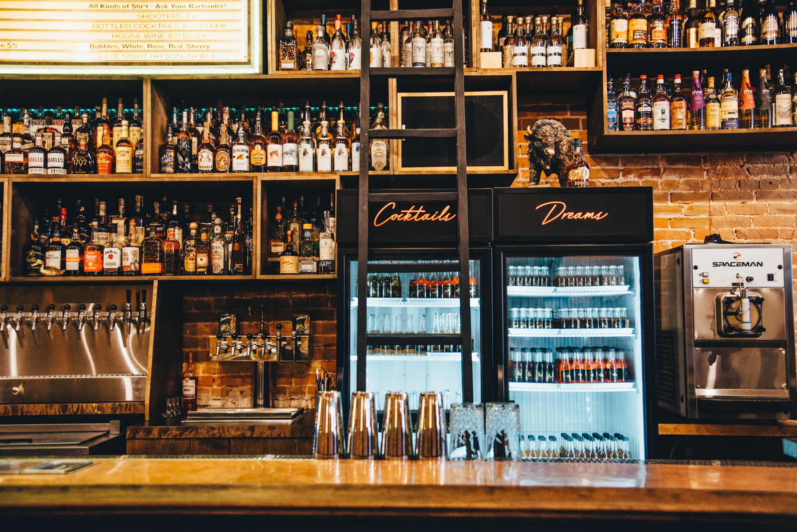
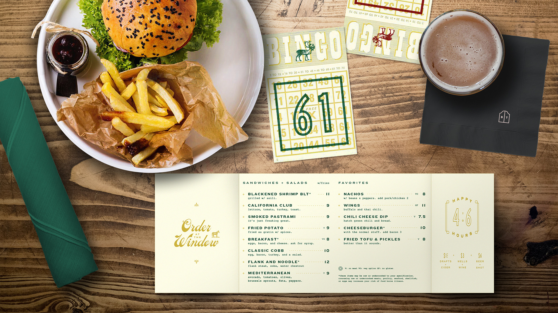
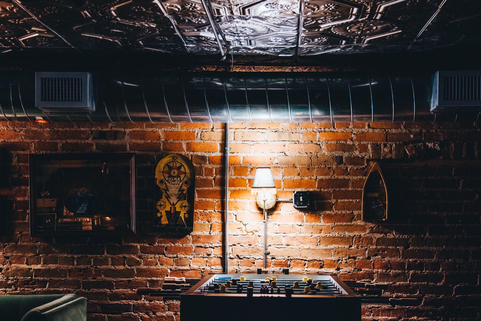
INTERIOR
The interior is flush with discoverables and artifacts. Each wall is decorated with found objects. The space feels curated but not staged, like an aunt’s living room.
One of the goals for “the window,” was to draw patrons through the space.
A found bingo board and some easily-changed plexiglass panels created a space reminiscent of a memorable and magnetic food truck to draw patrons back.

Brass Tacks.
Denver’s first dine bar.
A place for people looking for a place like this.
FIN