Daniel Quay
Work: Case Studies Identities Archive
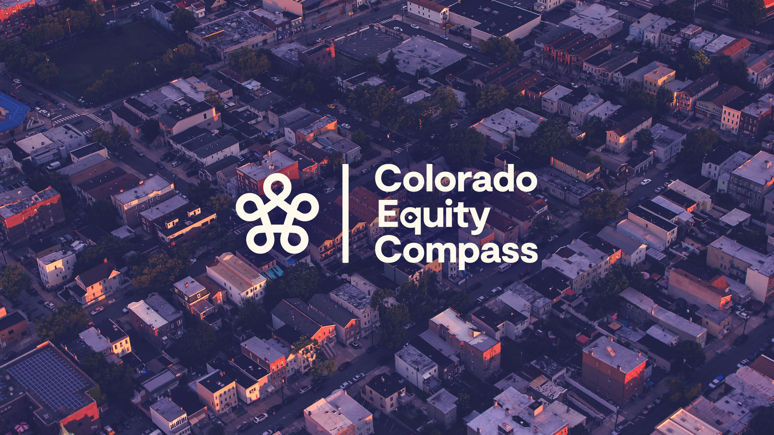
Colorado Equity Compass
THE ASSIGNMENT
Identity Design for an accessible, non-profit platform built to improve health equity outcomes across Colorado.
A public and reliable resource for data, information, advocacy and change-making work on neighborhood & state levels.
STUDIO
Consume & Create
Identity Design for an accessible, non-profit platform built to improve health equity outcomes across Colorado.
A public and reliable resource for data, information, advocacy and change-making work on neighborhood & state levels.
STUDIO
Consume & Create
ROLE
Art Director and Designer.
My largest contributions were designing the logo, color & type systems, and a healthy accessibility screening for vision disabilities & AAA WCAG compliance.
CREATIVE DIRECTION
Josh Wills
COPYWRITING & STRATEGY
Alicia Danielsen
LOGO ANIMATION BY GOOD FRIEND, WILLIAM JOHNSTON.
MUSE
The Colorado Equity Compass was born from a braintrust looking to address a complicated problem: Health equity decisions were being made without the insight of lived experiences, leading to well-meaning solutions that didn’t positively change health outcomes.
To create meaningful change, we must combine the wisdom of communities with the capability of changemakers.
The Colorado Equity Compass seeks to unite these stakeholders to raise up communities across the state.
THE LOGO
The mark was developed from a combination of a map pin, an abstracted home, and a network of connected focus to speak to approach and mission of the CEC.
We were inspired by the way the five Social Determinants of Health (SDoH) affect one another; each playing a significant and connected role in the CEC’s work.
The Colorado Equity Compass creates stronger neighborhoods by addressing the network of needs each neighborhood has, while keeping in those needs in context with the greater picture.
By approaching problems from individual angles with a holistic and connected understanding, we can better address health equity challenges in our neighborhoods.
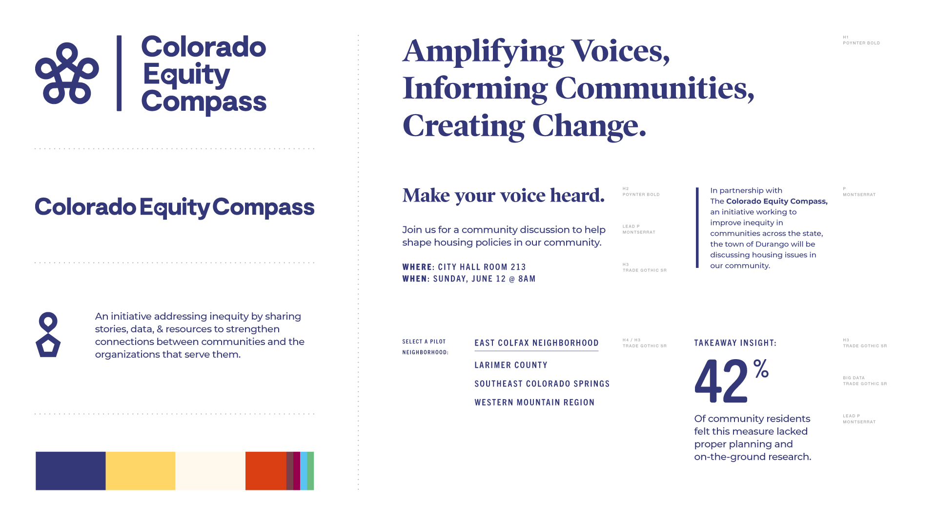
The Brand System
The deceptively simple brand system uses approachable & accessible typography to balance impressions of municipal authority and tech-forward data knowhow.
The deceptively simple brand system uses approachable & accessible typography to balance impressions of municipal authority and tech-forward data knowhow.
^ ICON DESIGN by user ‘stonuiiuntk’ at the Noun Project.
The Brand System - USABILITY
To amplify the usability of the CEC, we used freely-available Google Fonts for our paragraph type, Unsplash for photo sourcing, and Adobe Fonts for any Impact typography.
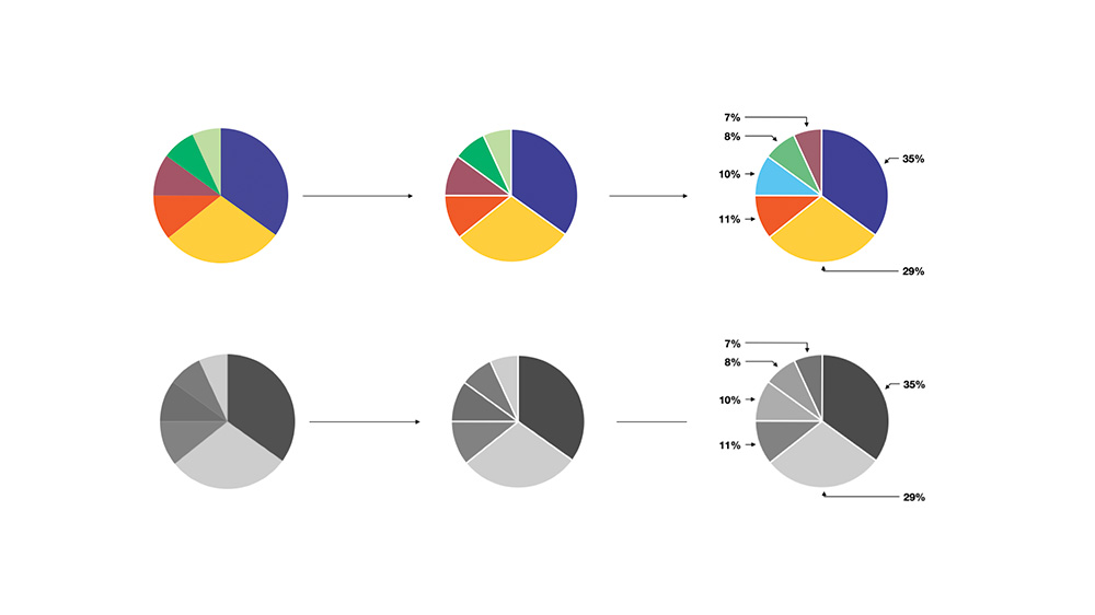
Additionally, we used widely-available resources like The Noun Project, and Keynote’s data representations to create styles that could be easily replicated for no / low cost.
Lowering the barrier for consistent representation ensures that the community can grow quickly and the platform can be used by more users.
Lastly, the system is WCAG AAA compliant, and maintains contrast a readability for users with vision disabilities. (more on that below)


The Brand System - DETAILS
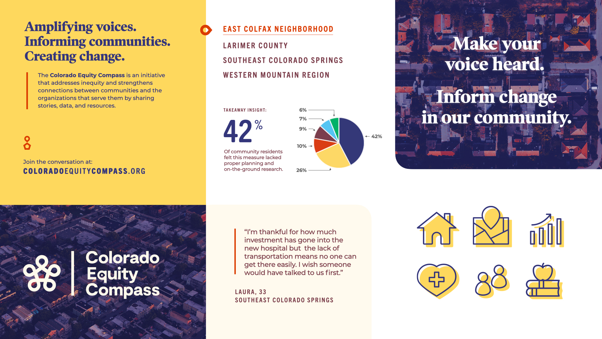
To nod to the individual experience, we use a “quote bar” to represent when someone is talking, or to draw attention to focal elements. This element references online forums; a place where all voices have equal opportunity for visibility.
To nod to the individual experience, we use a “quote bar” to represent when someone is talking, or to draw attention to focal elements. This element references online forums; a place where all voices have equal opportunity for visibility.
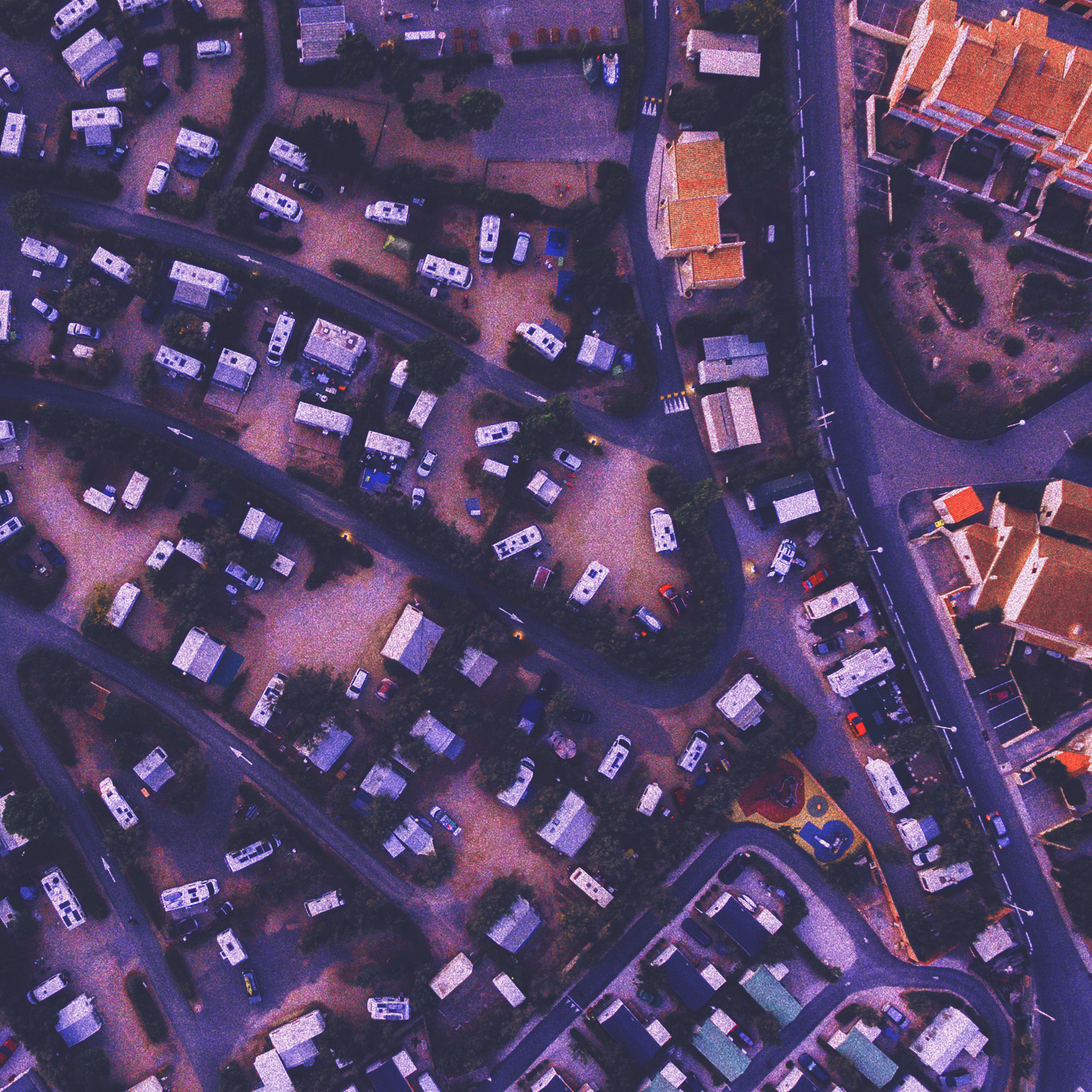
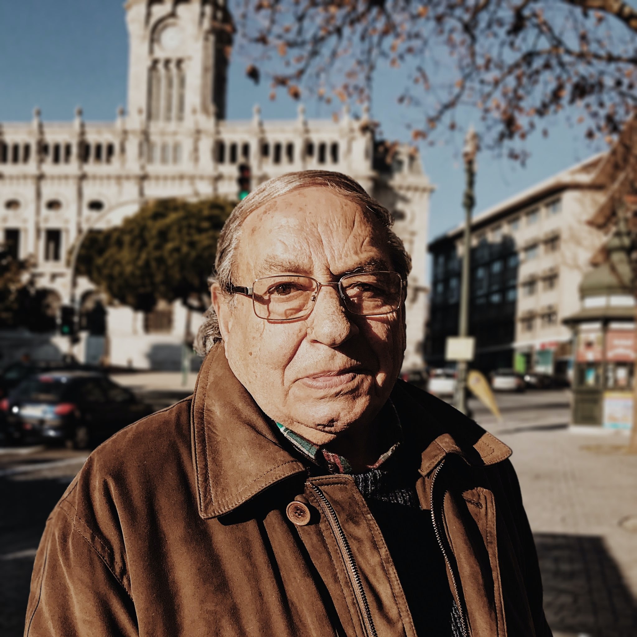

PHOTO DIRECTION
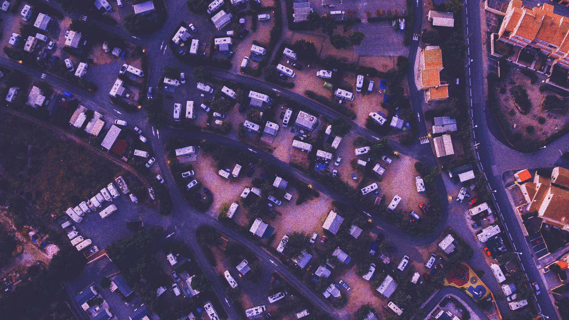
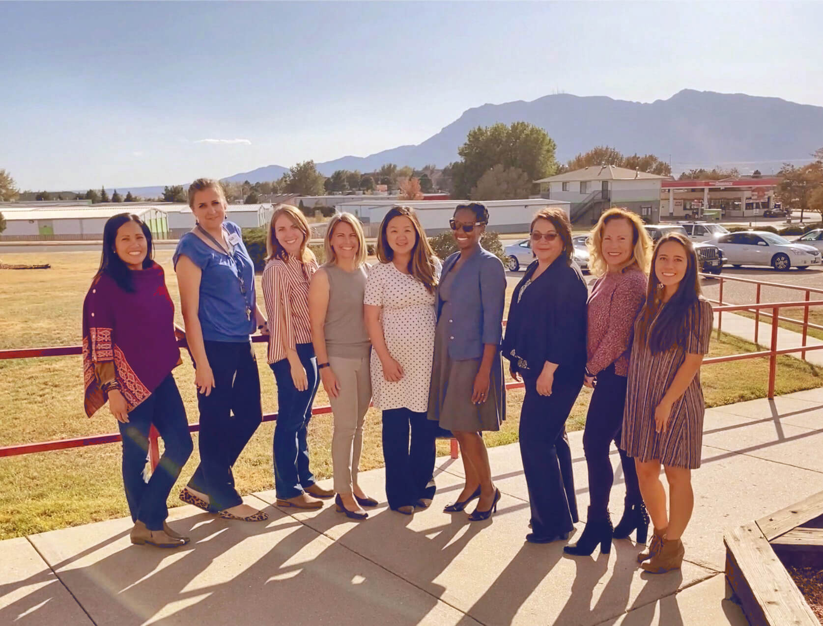
CEC advances health outcomes by using neighborhood-level lived experiences to add context to generalized, overview data.
We sourced various overhead imagery to represent “macro” data and experiential and familial images to represent “micro” data. Using both image styles together mimics the tension, impact, connectivity of both of these data types.
ACCESSIBILITY
To ensure accessibility, The brand system underwent a rigorous contrast audit for users with visual disabilities. Additionally, The system is WCAG AAA contrast-compliant.
Big shout out to the app Michel Fortin’s open source, colorblindness simulation app, Sim Daltonism for making accessibility easy.
The Colorado Equity Compass.
Amplifying Voices, Informing Communities, Creating Change.
FIN