Daniel Quay
Work: Case Studies Identities Marks Archive
Futurebound
THE ASSIGNMENT
An accessible, impact-focused ecosystem with a sense of urgency.
STUDIO
Consume & Create
Identity Design for a movement of changemakers fueling innovation in child development.
An accessible, impact-focused ecosystem with a sense of urgency.
STUDIO
Consume & Create
ROLE
Art Director and Lead Designer.
My largest contributions were designing the logo, supporting design and type systems, iconography, social media direction, and photo direction.
CREATIVE DIRECTION
Josh Wills
DESIGN SUPPORT
Alicia Danielsen, Dylan Fowler, & William Johnston
CONTRIBUTING DESIGNERS CITED ON RELEVANT IMAGERY.
SUMMIT PHOTOGRAPHY BY RYAN POLICKY

MUSE
Futurebound exists to accelerate innovation and impact for young children in Colorado. The moment needed to carry a feeling of synthesis, acceleration, urgency, and forward direction.
Inspired by protest signs and the energy and excitement of the World’s Fair, the design language speaks to innovation, impact and a focus on meaningful, progressive change.

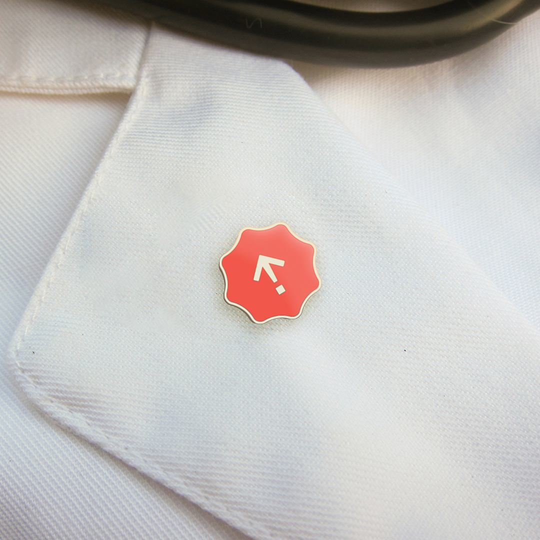
THE LOGO
The Logo was developed from a combination of a forward arrow and an exclamation point; Futurebound is moving forward, moving now, and moving with urgency. The mark framing speaks to a safety net, a parachute, and a launchpad, all in one.
The Logo was developed from a combination of a forward arrow and an exclamation point; Futurebound is moving forward, moving now, and moving with urgency. The mark framing speaks to a safety net, a parachute, and a launchpad, all in one.
THE LOGOTYPE
The paired logotype uses the Suisse Int’l typeface to present an approachable sense of authority, veering from the pitfall of representing an adolescent-focused org with a juvenile or elementary lens.
The paired logotype uses the Suisse Int’l typeface to present an approachable sense of authority, veering from the pitfall of representing an adolescent-focused org with a juvenile or elementary lens.
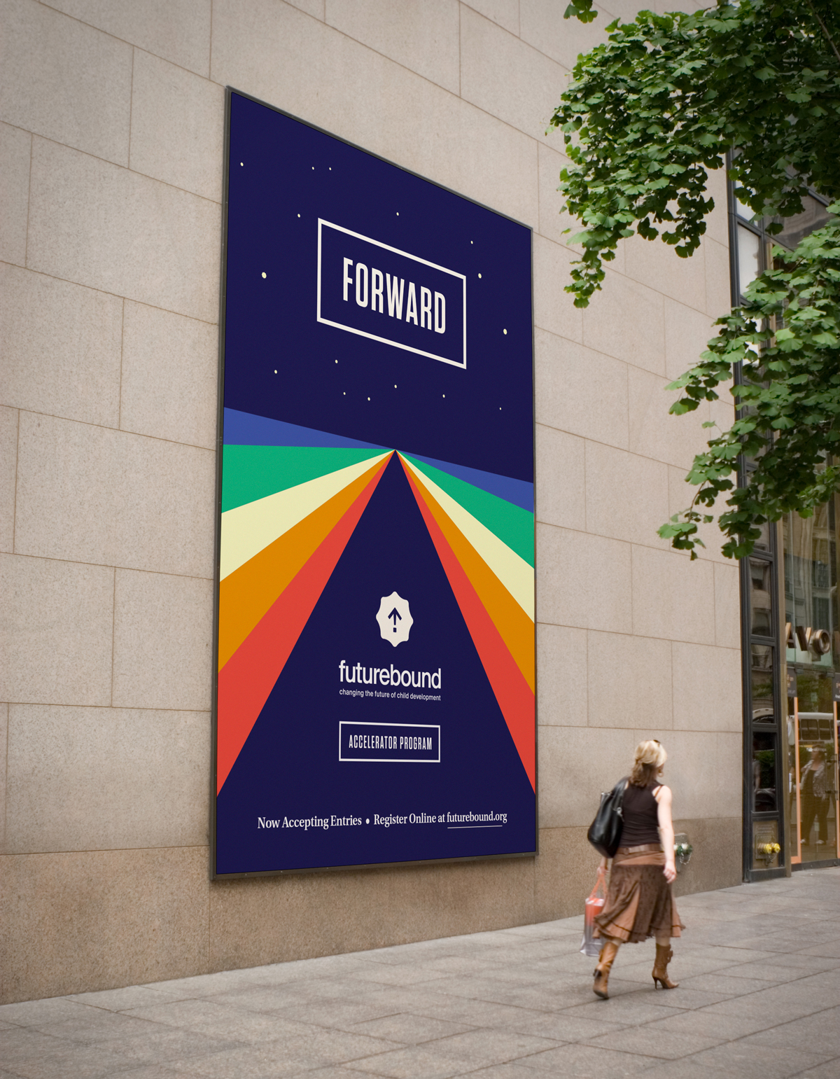

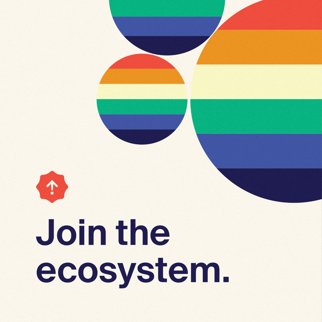
THE SECONDARY SYSTEM
A graphic “ray” language speaks to the shared vision of the varied members of the Futurebound ecosystem, and the way that the group involvement catalyzes change. Graphics carry the viewers eye into “the horizon” and speak to many becoming one.
A graphic “ray” language speaks to the shared vision of the varied members of the Futurebound ecosystem, and the way that the group involvement catalyzes change. Graphics carry the viewers eye into “the horizon” and speak to many becoming one.
THE TYPE SYSTEM
To communicate a sense of urgency, the system uses framed, impact type to “focus on what’s important.”
To communicate a sense of urgency, the system uses framed, impact type to “focus on what’s important.”
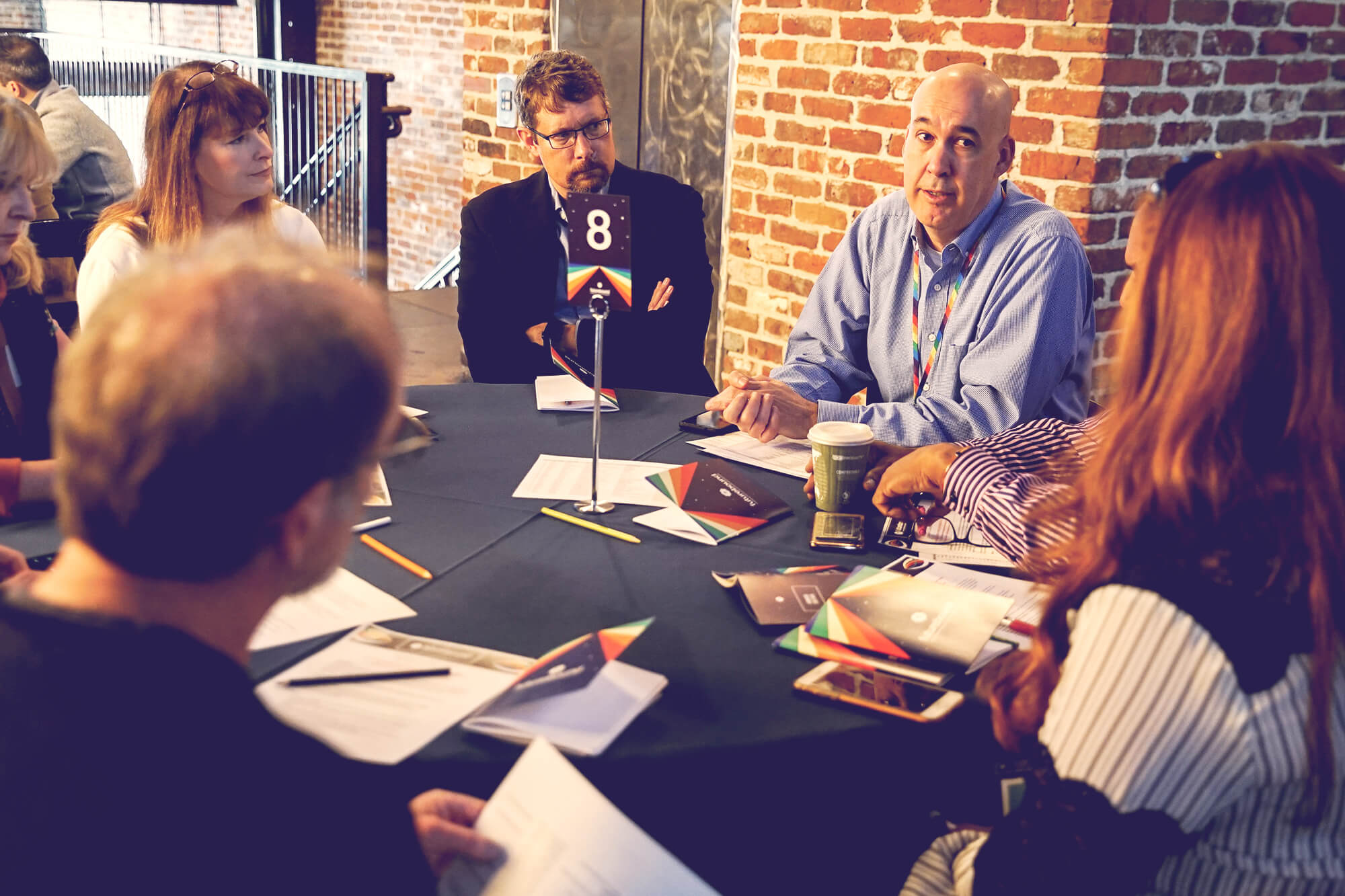


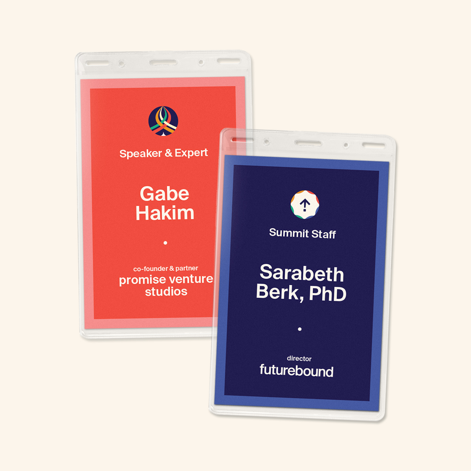
ICONOGRAPHY
An icon system distinguishes each persona within the ecosystem, developing a common language for way finding, signage, and badging. Each icon was inspired by early advertisements for the World’s Fair.
An icon system distinguishes each persona within the ecosystem, developing a common language for way finding, signage, and badging. Each icon was inspired by early advertisements for the World’s Fair.


PHOTO DIRECTION
Blur and color treatment make each photo into a “cherished memory;” Each photo tells a tale of a child’s happiness, whether in the past, or on the horizon. Overlaying type communicates a sense of “not yet;” The future is beautiful, but first, we have work to do.
Blur and color treatment make each photo into a “cherished memory;” Each photo tells a tale of a child’s happiness, whether in the past, or on the horizon. Overlaying type communicates a sense of “not yet;” The future is beautiful, but first, we have work to do.
Admittedly, pitching blurry photos seemed like a risk, but as the system came to life, these “magic moments” often created the warmth and depth that the impact-heavy system needed to flourish. The concept brought a director of the ecosystem to tears.


SOCIAL MEDIA BRANDING
As the system pushed to social media channels, the imagery, photography, and type-driven posts meshed together to create a impact-focused feed.
As the system pushed to social media channels, the imagery, photography, and type-driven posts meshed together to create a impact-focused feed.

Futurebound.
Changing the future of child development.
Forward. Together.
FIN