Daniel Quay
Work: Case Studies Identities Archive
National Pain Advocacy Center
THE ASSIGNMENT
Identity Design for a progressive advocacy non profit that advances the health & human rights of people in pain.
An insightful and inclusive group that dives deep into the nuances of pain treatment in America.
LOGO ANIMATION BY GOOD FRIEND, WILLIAM JOHNSTON.
Identity Design for a progressive advocacy non profit that advances the health & human rights of people in pain.
An insightful and inclusive group that dives deep into the nuances of pain treatment in America.
LOGO ANIMATION BY GOOD FRIEND, WILLIAM JOHNSTON.
ABOUT NPAC
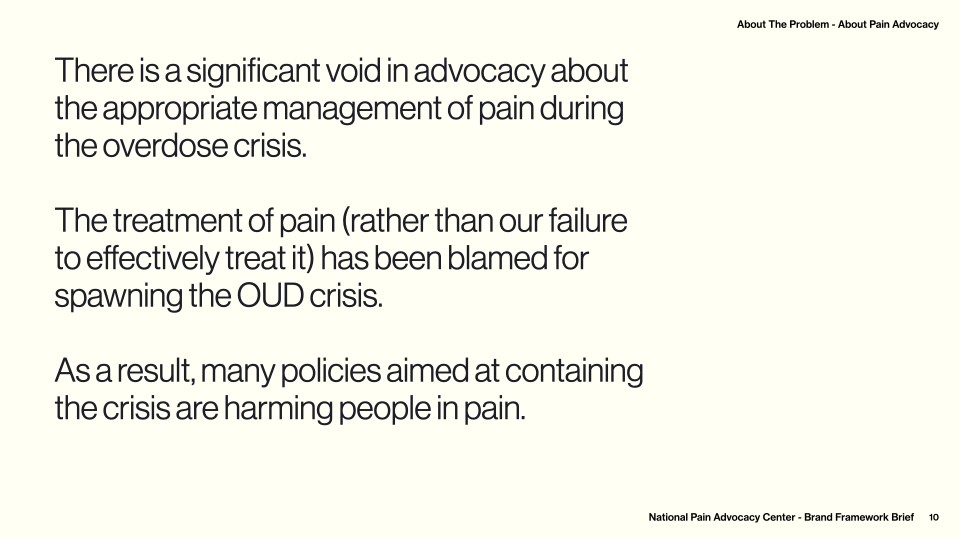
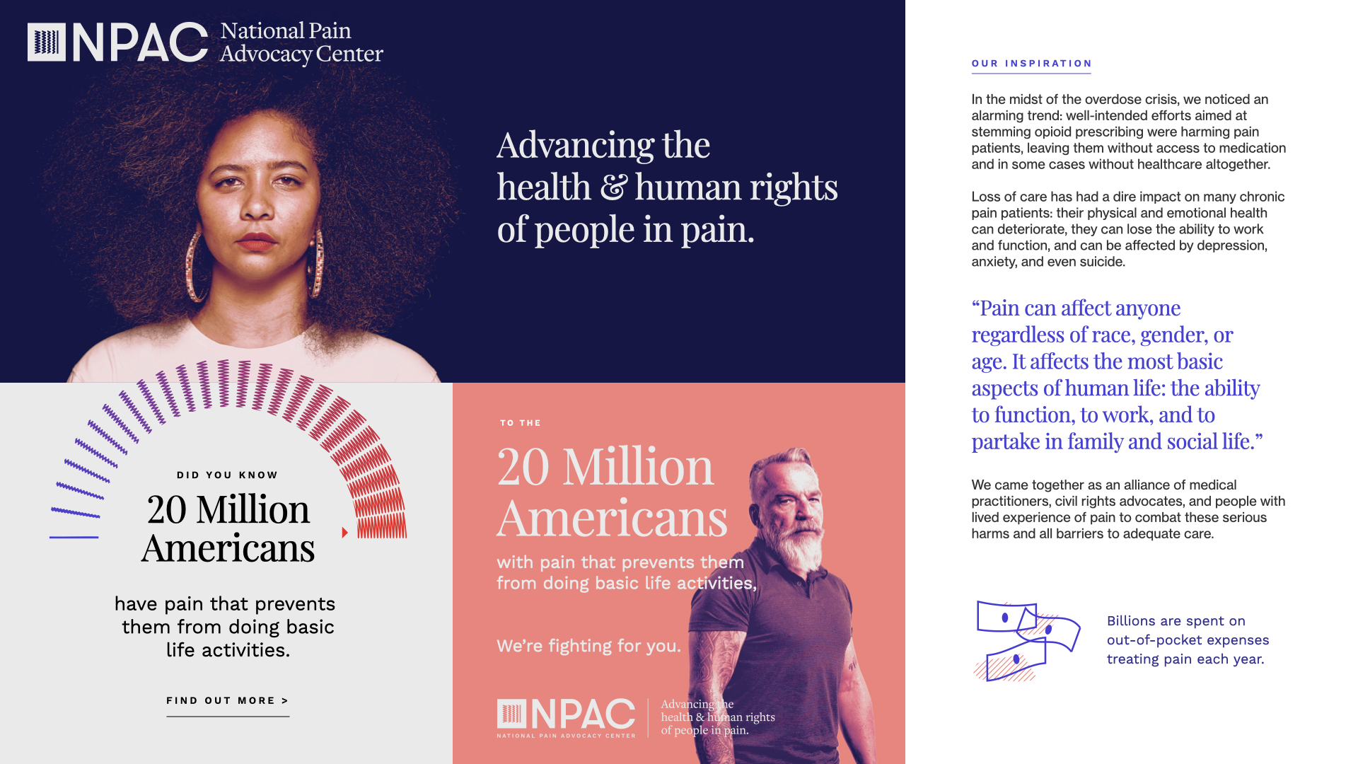
In the midst of the overdose crisis, NPAC noticed an alarming trend: well-intended efforts aimed at stemming opioid prescribing were harming pain patients, leaving them without access to medication and in some cases without healthcare altogether.
Loss of care has had a dire impact on many chronic pain patients: their physical and emotional health can deteriorate, they can lose the ability to work and function, and can be affected by depression, anxiety, and even suicide.
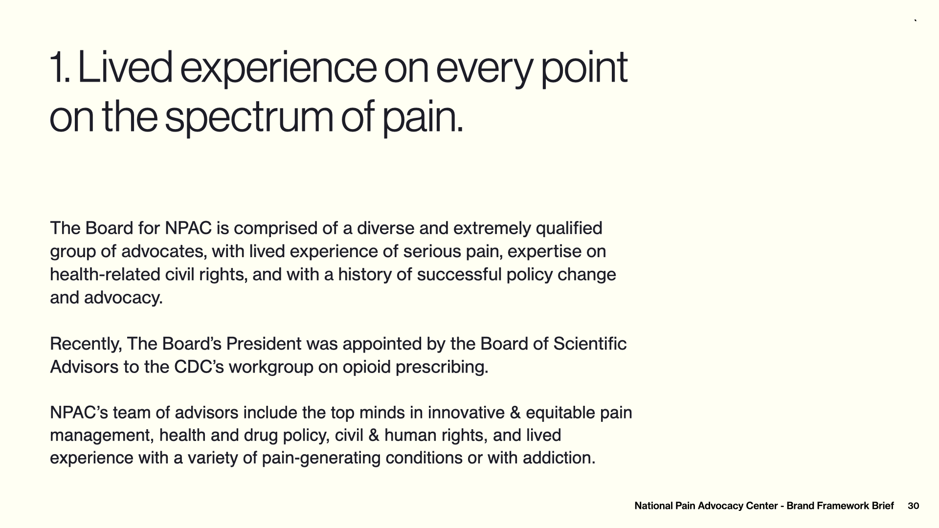
NPAC came together as an alliance of medical practitioners, civil rights advocates, and people with lived experience of pain to combat these serious harms and all barriers to adequate care.
In the midst of the overdose crisis, NPAC noticed an alarming trend: well-intended efforts aimed at stemming opioid prescribing were harming pain patients, leaving them without access to medication and in some cases without healthcare altogether.
Loss of care has had a dire impact on many chronic pain patients: their physical and emotional health can deteriorate, they can lose the ability to work and function, and can be affected by depression, anxiety, and even suicide.
NPAC came together as an alliance of medical practitioners, civil rights advocates, and people with lived experience of pain to combat these serious harms and all barriers to adequate care.
^SOME OF This work was built on foundation vision/values brand work started by Brandi at BrandPrep.
BRAND STRATEGY
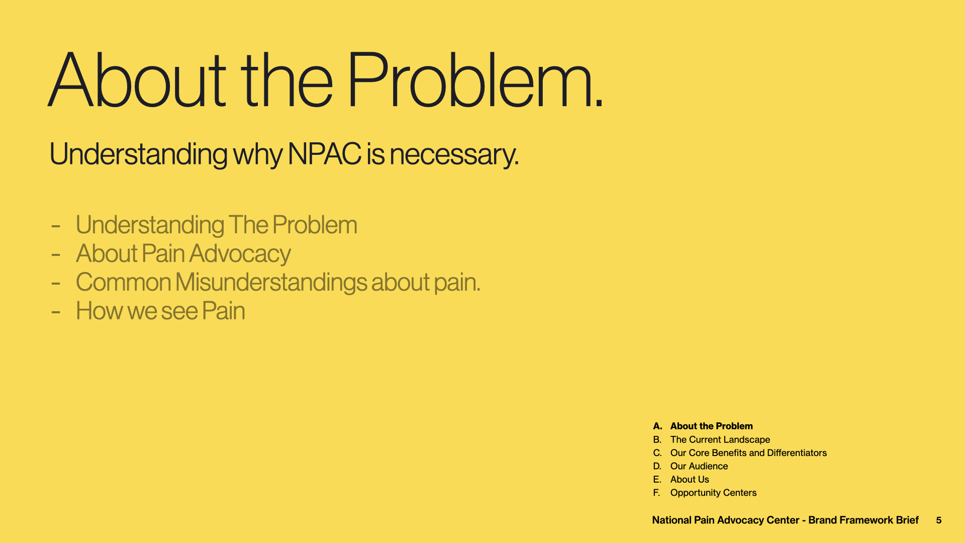
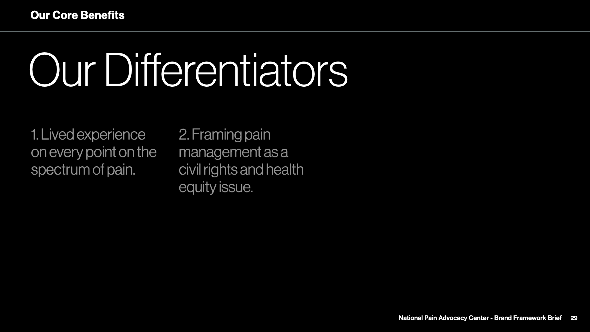
Because NPAC operates in a space that carries potential for controversy, before diving into visuals, I spent a healthy amount of time with the board of directors making sure we agreed on exactly what NPAC stood for, the target audiences we were addresing, our differentiators within the space, and visual and verbal tone.
Several brand workshops later, we landed on a sturdy, 59-page Brand Framework Brief to reference during the design process. The BFB proved to be an incredibly valuable resource for visual and messaging development.
The Brand Framework Brief can be visited here.
MUSE
As I moved into design, I was struck by the concept of empathy.
As Joseph Stalin infamously said, “The death of one man is a tragedy. the death of millions is a statistic.” How can we see the experience of an individual’s pain if we are looking through a macro lens?
I sought to tell the story of an individuals’ experience throughout the pain spectrum.

THE LOGO
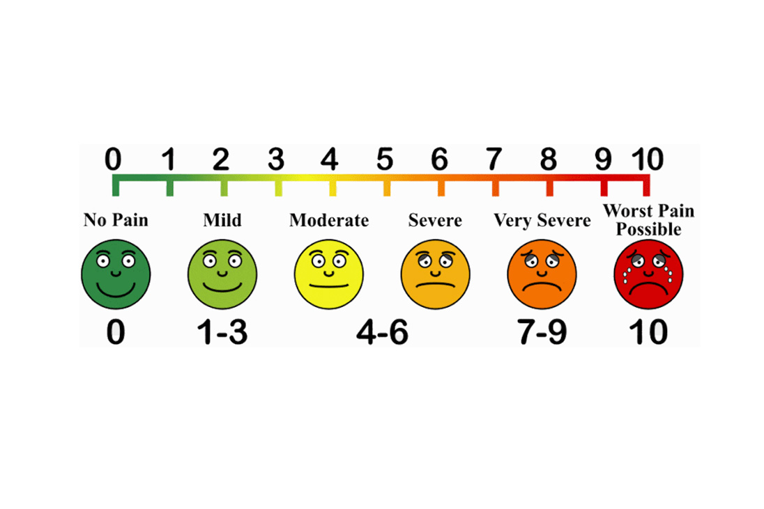
To reimagine a visual representation of the pain experience, I used color and shape to artistically communicate the spectrum of felt pain.
The mark takes this spectrum, simplifies it, and flips the orientation to tell a story of an individual’s journey to pain management.
Heavy framing tempers the mark, keeping the brand feeling authoritative and informed.
The Brand System
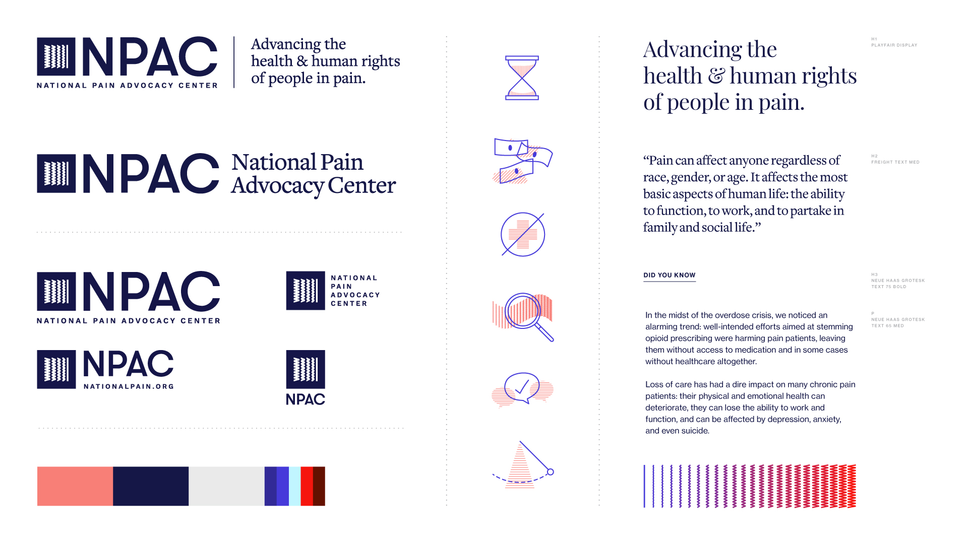
Policymaking organizations have a unique challenge with brand representation.
Certain applications may require a larger sense of governmental authority, while some marketing applications may benefit from a more humanized expression. Additionally, some applications may be in context with other initialisms, and some may require readability in a micro setting.
To meet the varied needs of a policymaking organization, I developed a in-depth system of logo lockups, to ensure NPAC looks “in league” whenever represented.
THE DESIGN SYSTEM
The design system takes cues from progressive thinkers in policy and editorial space to tow the line between unapologetically modern and authoritatively sensible.
The design system takes cues from progressive thinkers in policy and editorial space to tow the line between unapologetically modern and authoritatively sensible.
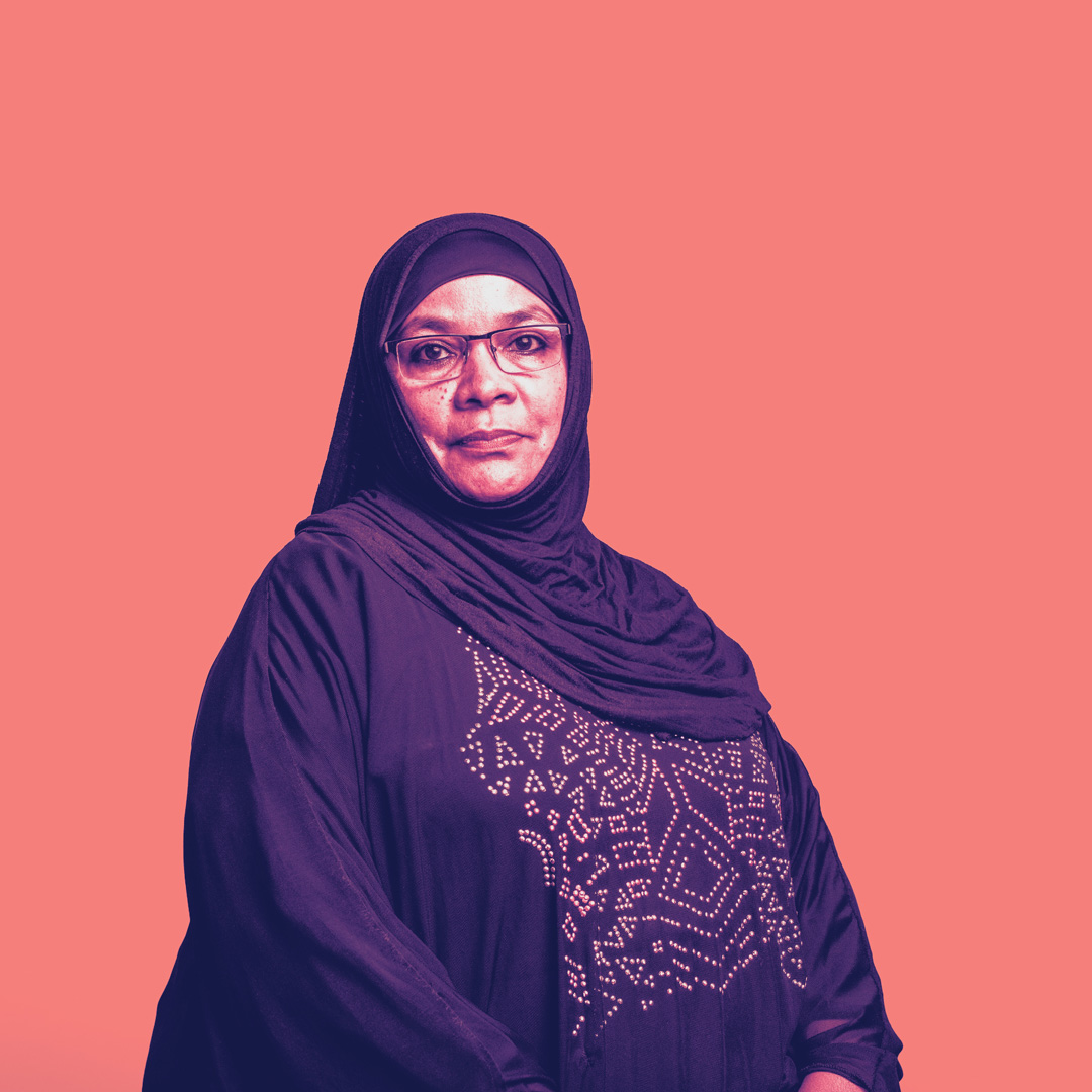


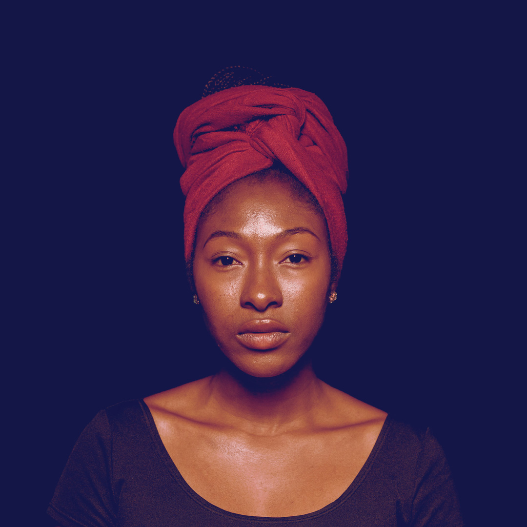

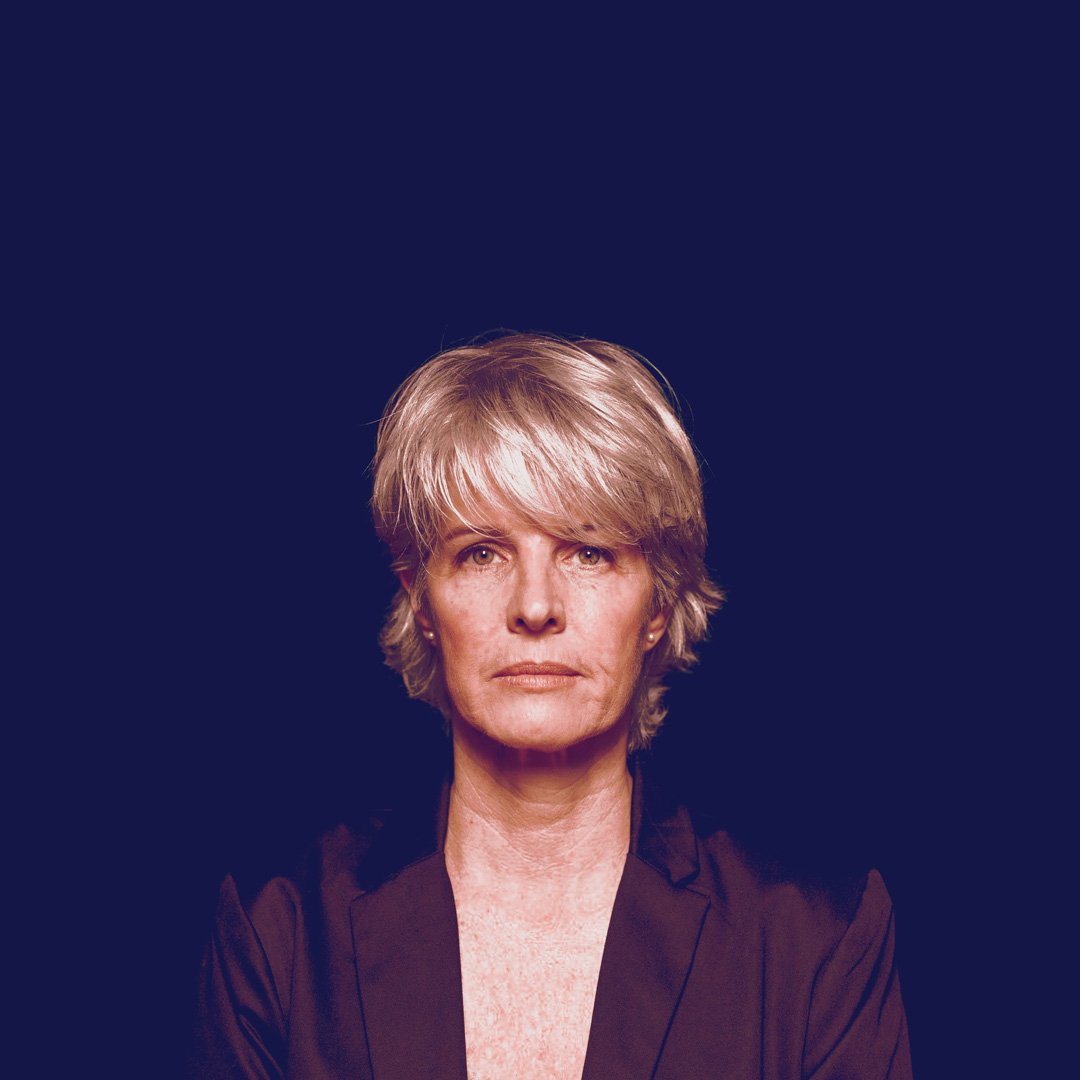
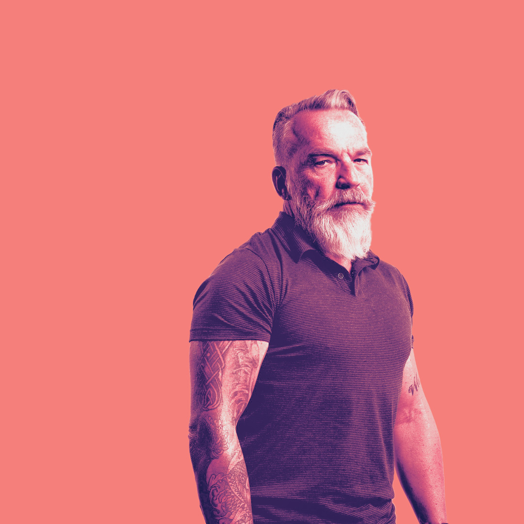
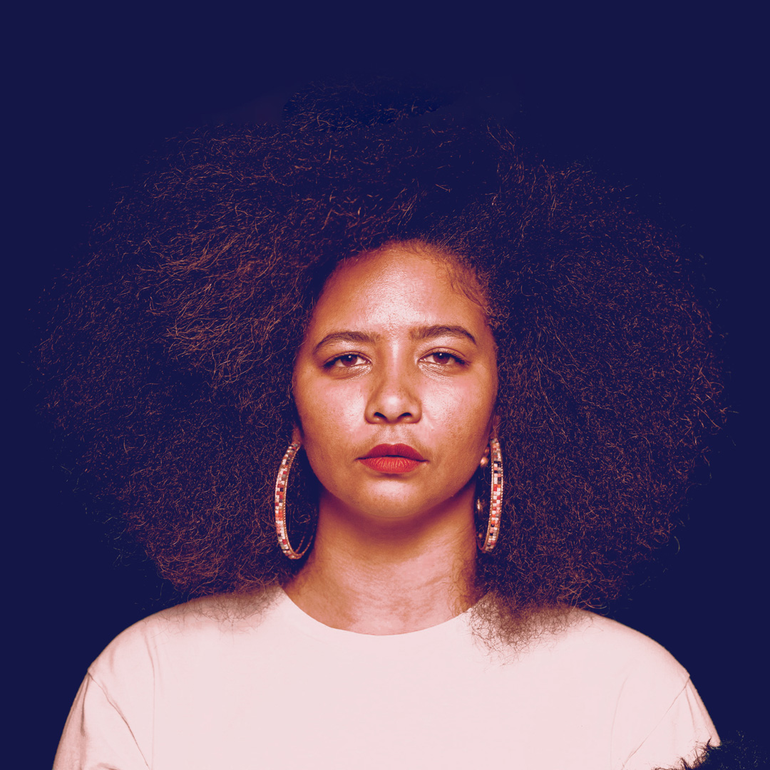

PHOTO DIRECTION
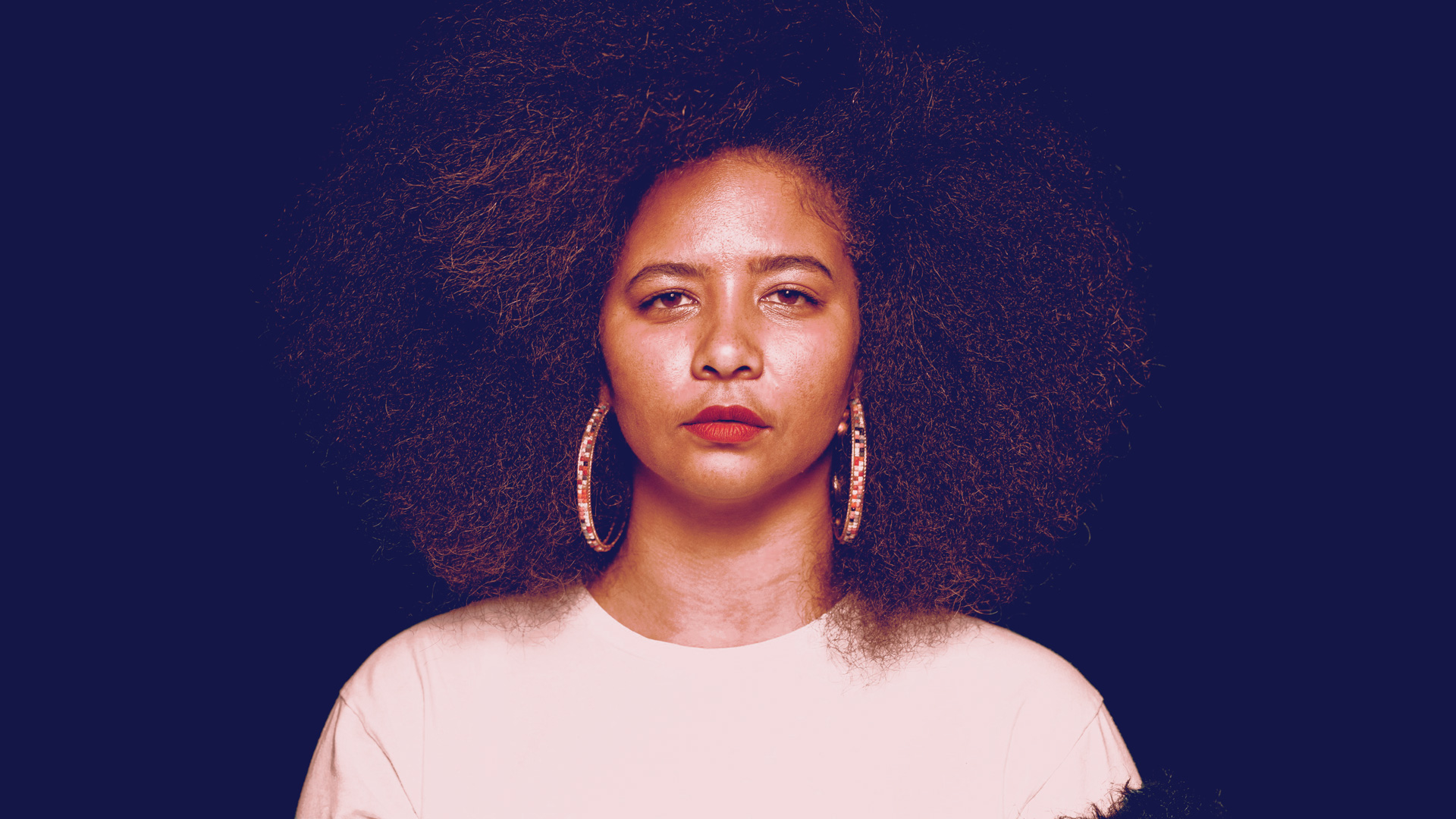
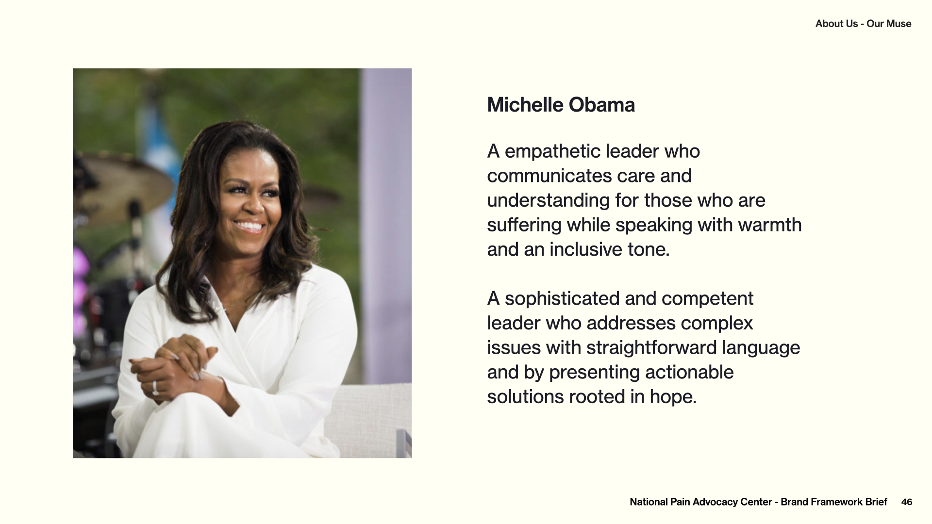
To communicate the individual’s experience, I created a photo style that encourages empathy by representing the individual. I avoided explotative imagery, or overtly-caricatured experiences of pain, and instead sought images of individuals showing a determined and resolute demeanor. Overcoming pain is a daily fight, and those experiencing pain are fighters.
Pain is a human issue, and can affect people from any and all backgrounds. By expressing a diverse range of individuals experiencing pain, the viewer is encouraged to ask who in their life may be experiencing unmanaged pain “beneath the surface.”


National Pain Advocacy Center
Advancing the health & human rights of people in pain.
FIN